On this page


Context
Addifab developed Freeform Injection Molding (FIM) a hybrid manufacturing process combining 3D printing with injection molding. Despite having genuinely innovative technology, their website couldn't convert technical evaluators into qualified leads. Their 4-6 month sales cycle was killing growth.
I led a complete redesign of their brand identity and digital experience, restructuring how they communicate complex technical information. The result: a website that educates, qualifies, and converts manufacturing buyers automatically.
Challenge
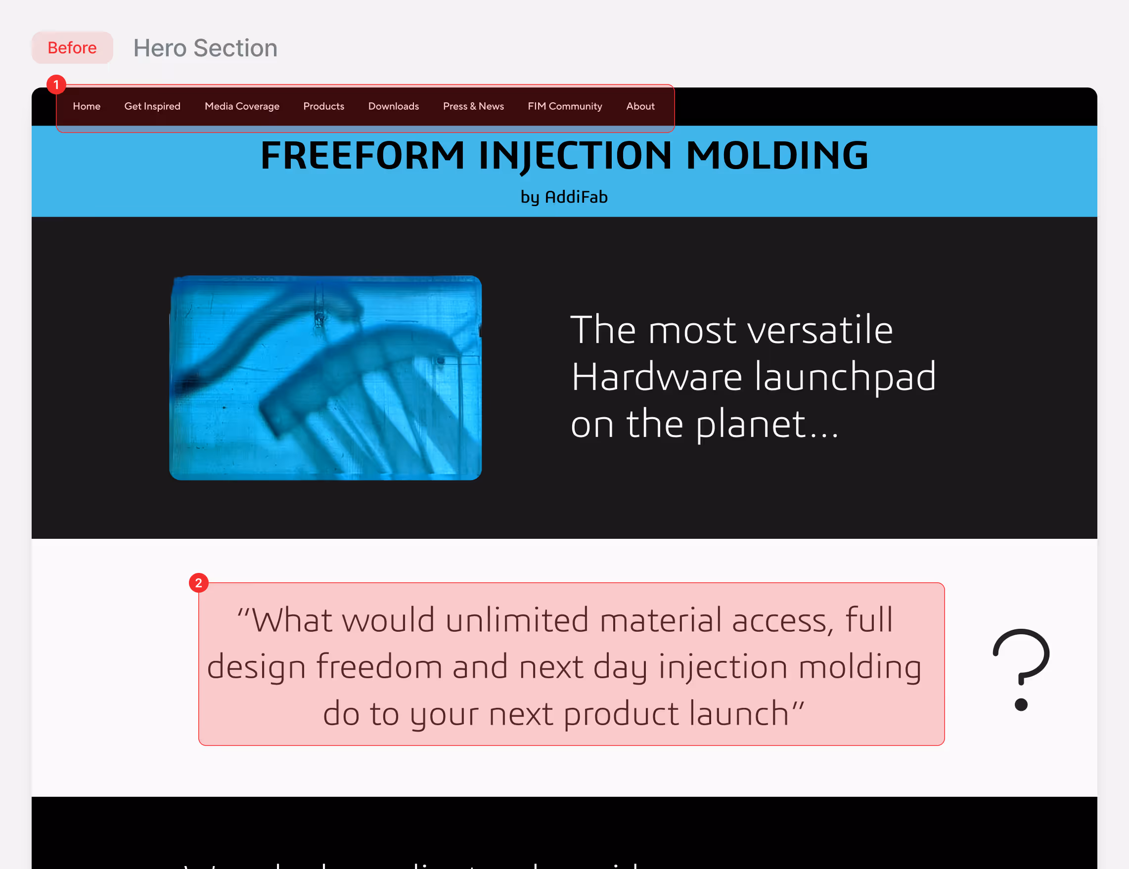
Manufacturing buyers evaluate new technologies through specific criteria: capabilities, tolerances, materials, cost. Addifab's site opened with marketing fluff before establishing technical credibility.
Through 12 interviews with engineers and procurement managers, one insight shaped everything:
"I don't care if it's revolutionary. I need to know: what materials, what tolerances, what lead time, what cost per part."
– Mechanical Engineer, Medical Device Manufacturer
Information Architecture
Navigation assumed familiarity with FIM. The structure was vendor-centric rather than buyer-centric. Engineers couldn't find a logical path through content.
Technical Communication Gap
FIM is unfamiliar to most engineers. The old site tried to explain everything at once with dense text. Result: 80% bounce rate on home page & internal explanation pages.
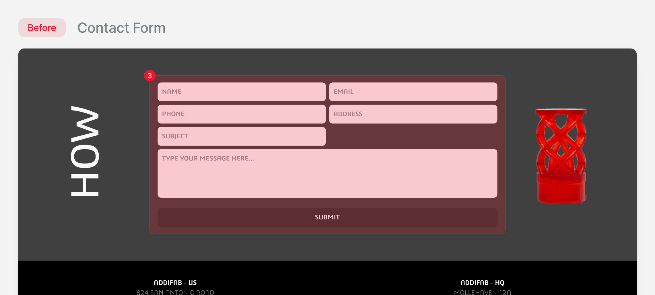
Zero Qualification
Generic contact forms generated 40+ monthly inquiries, but only 15% were qualified. Sales wasted hours on discovery with unqualified prospects.
Goal
Transform Addifab's digital presence to reduce time-to-qualification for prospects and increase inbound demo quality, enabling the sales team to focus on closing rather than educating.
Success Metrics
User Engagement
Increase visits to "Technology" and time spent on Materials pages, indicating improved understanding and self-service technical evaluation.
Conversion Growth
Increase demo requests and reduce bounce rates on key pages, showing stronger content relevance and visitor intent alignment.
Sales Enablement
Reduce average first-call duration by providing prospects with baseline FIM understanding before conversations. Improve sales team's perception of lead quality.
Operational Efficiency
Decrease technical support emails regarding materials, tolerances, and basic process questions through better self-service content.
Solution
A complete brand and digital redesign that transforms how Addifab communicates FIM technology. The new system provides visual clarity through a modernized identity, educational content architecture that guides technical buyers naturally, and a high-performance website that qualifies and converts prospects automatically.
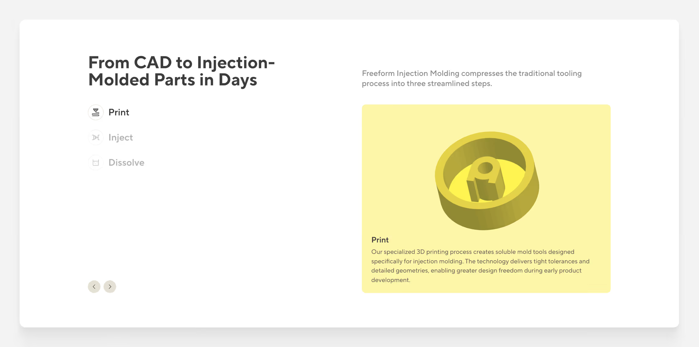
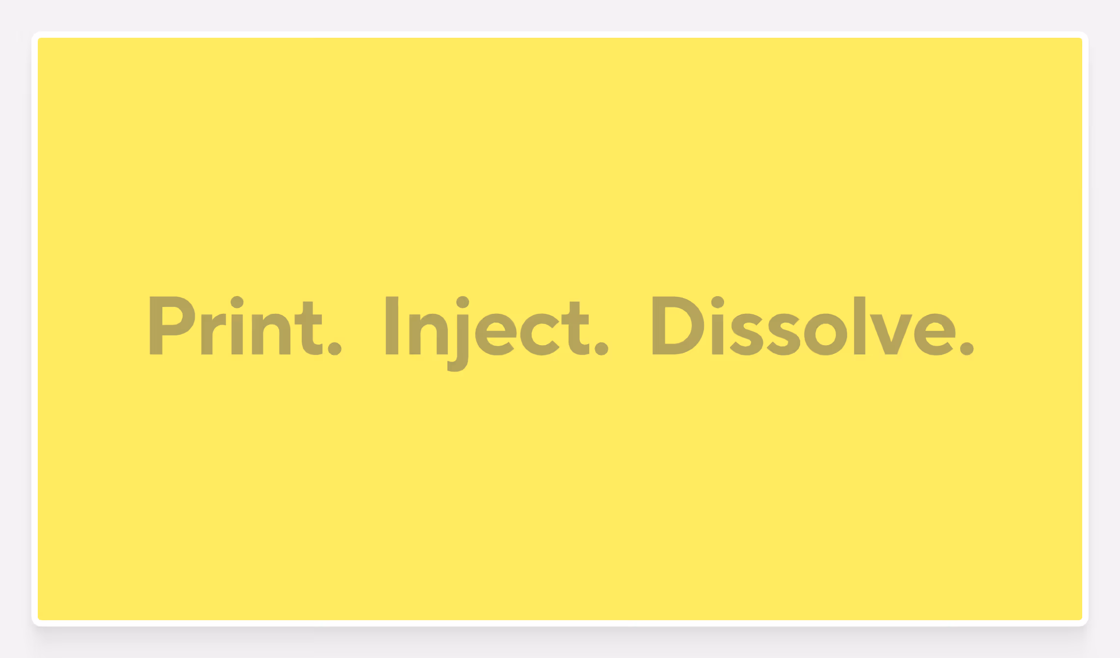
Making FIM Understandable
Transformed complex technical explanation into a progressive three-step visual narrative that increased page engagement.
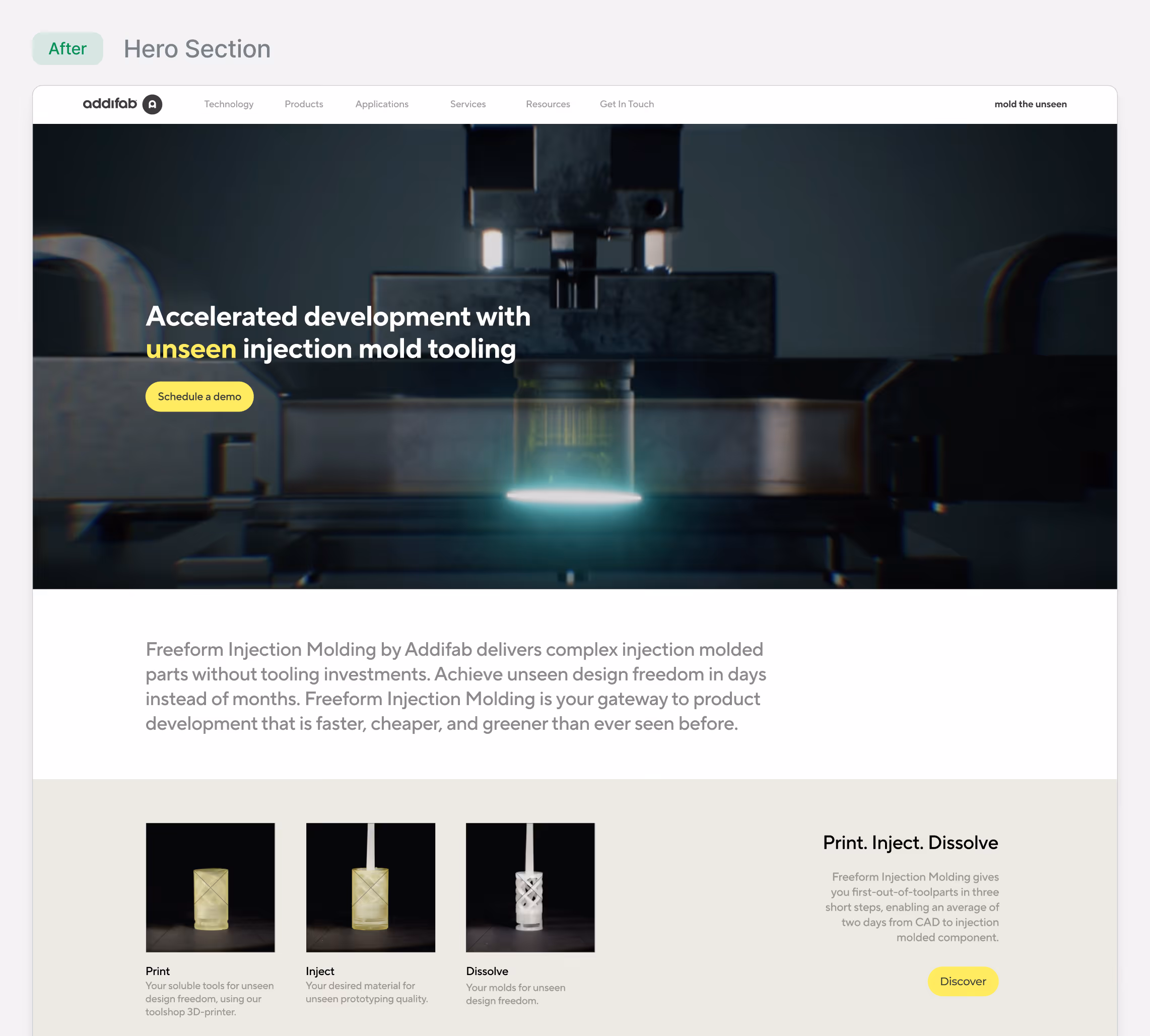
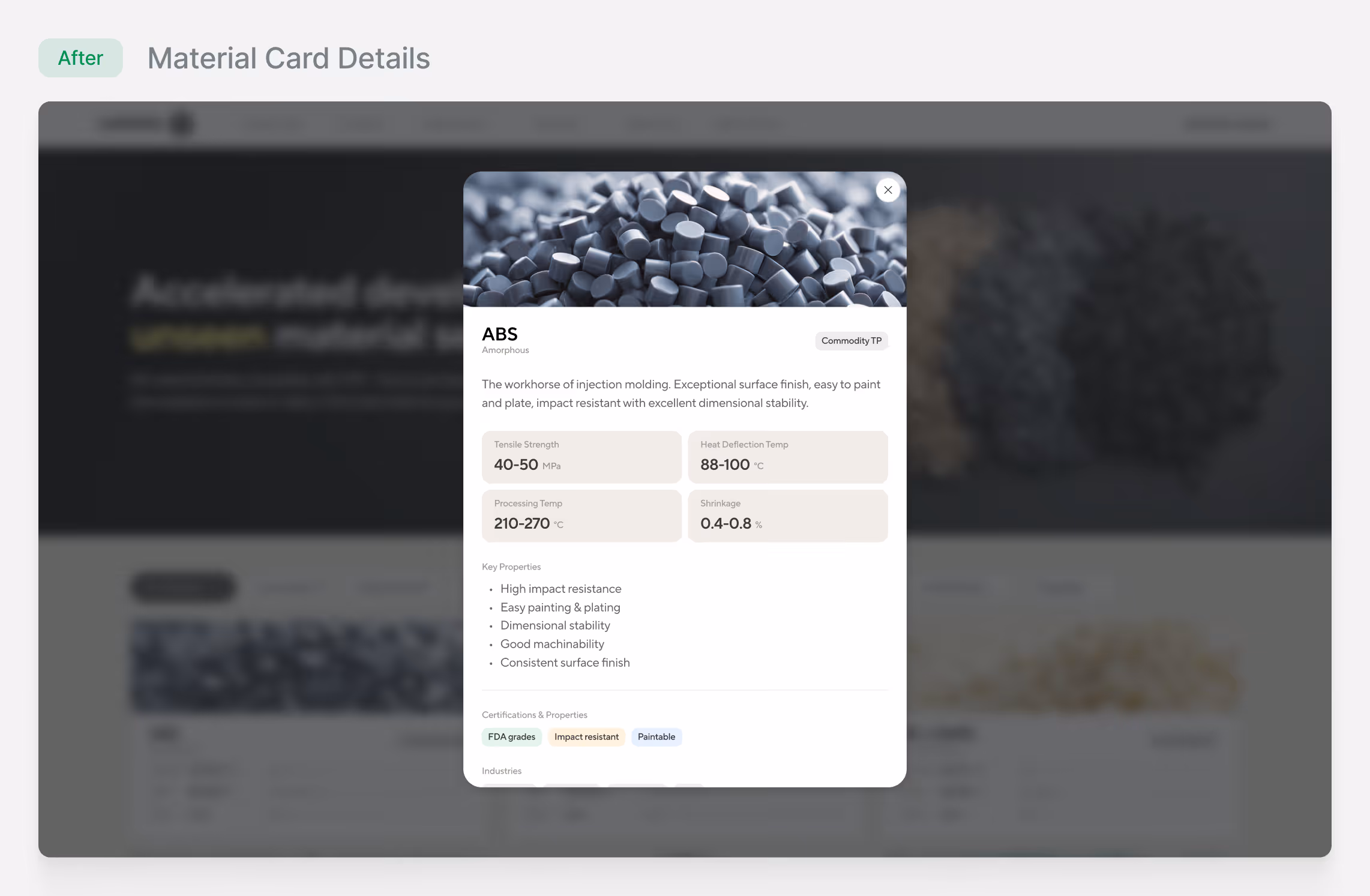
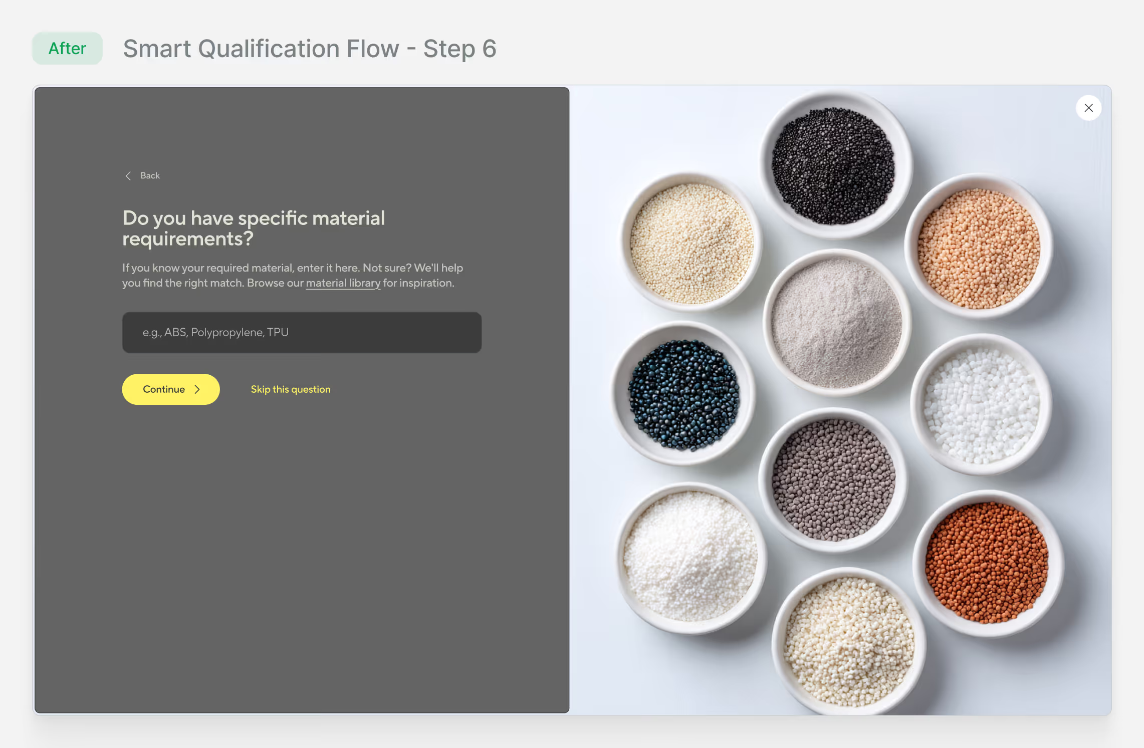
Materials as a Decision Tool
Created self-service material library with specifications, reducing support emails by 62% and making Materials the 2nd most-visited page.
.avif)
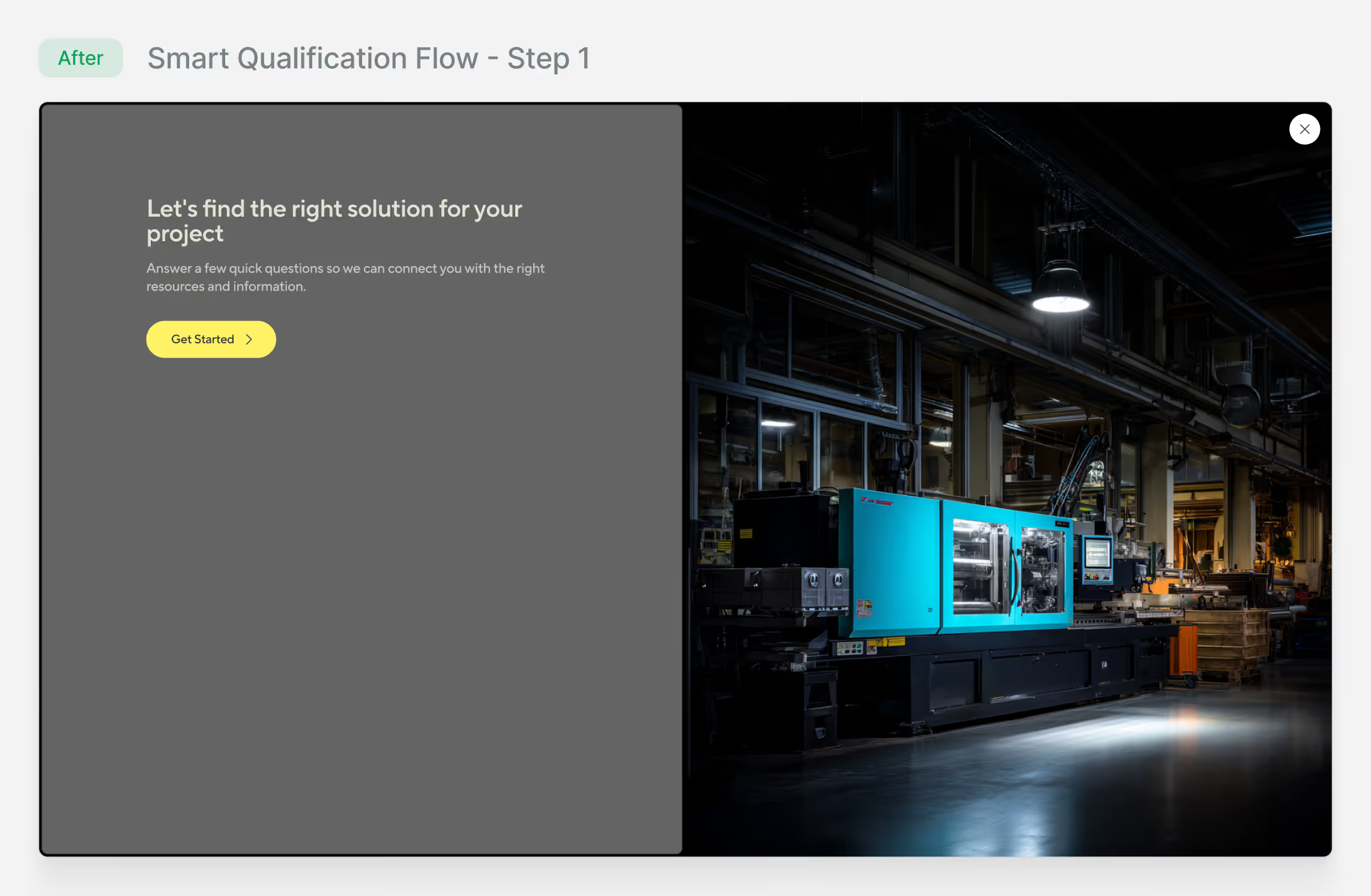
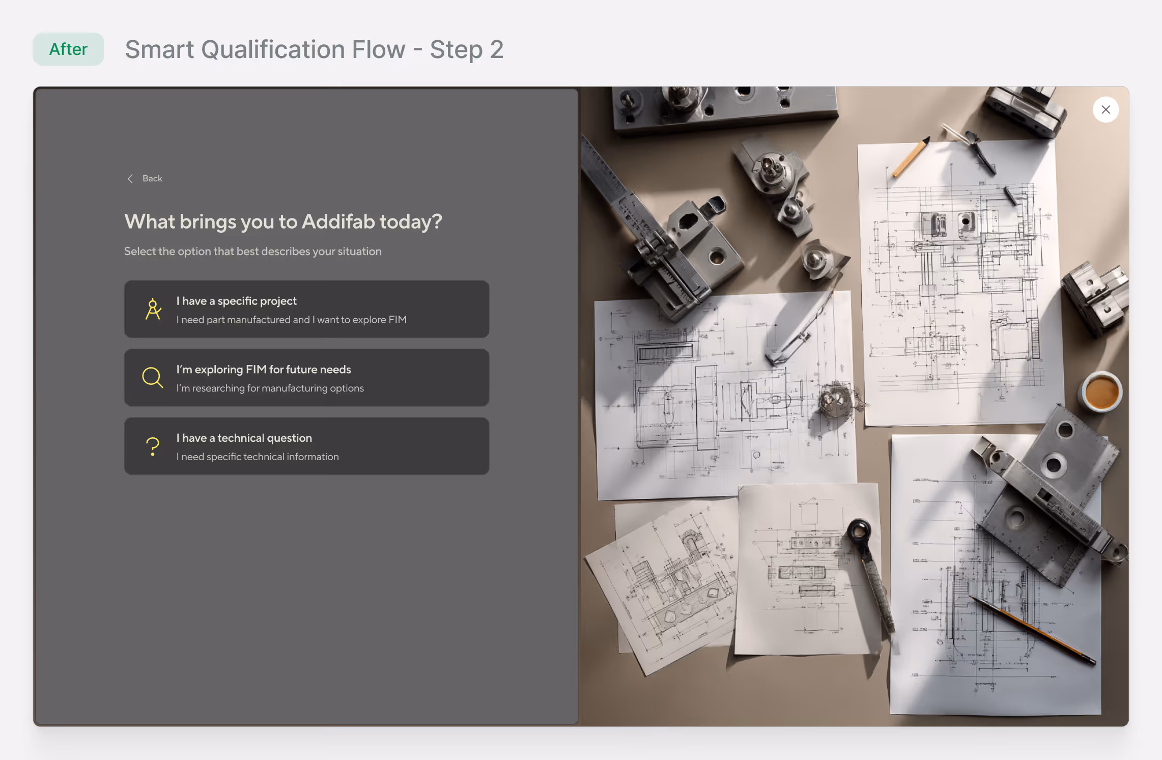
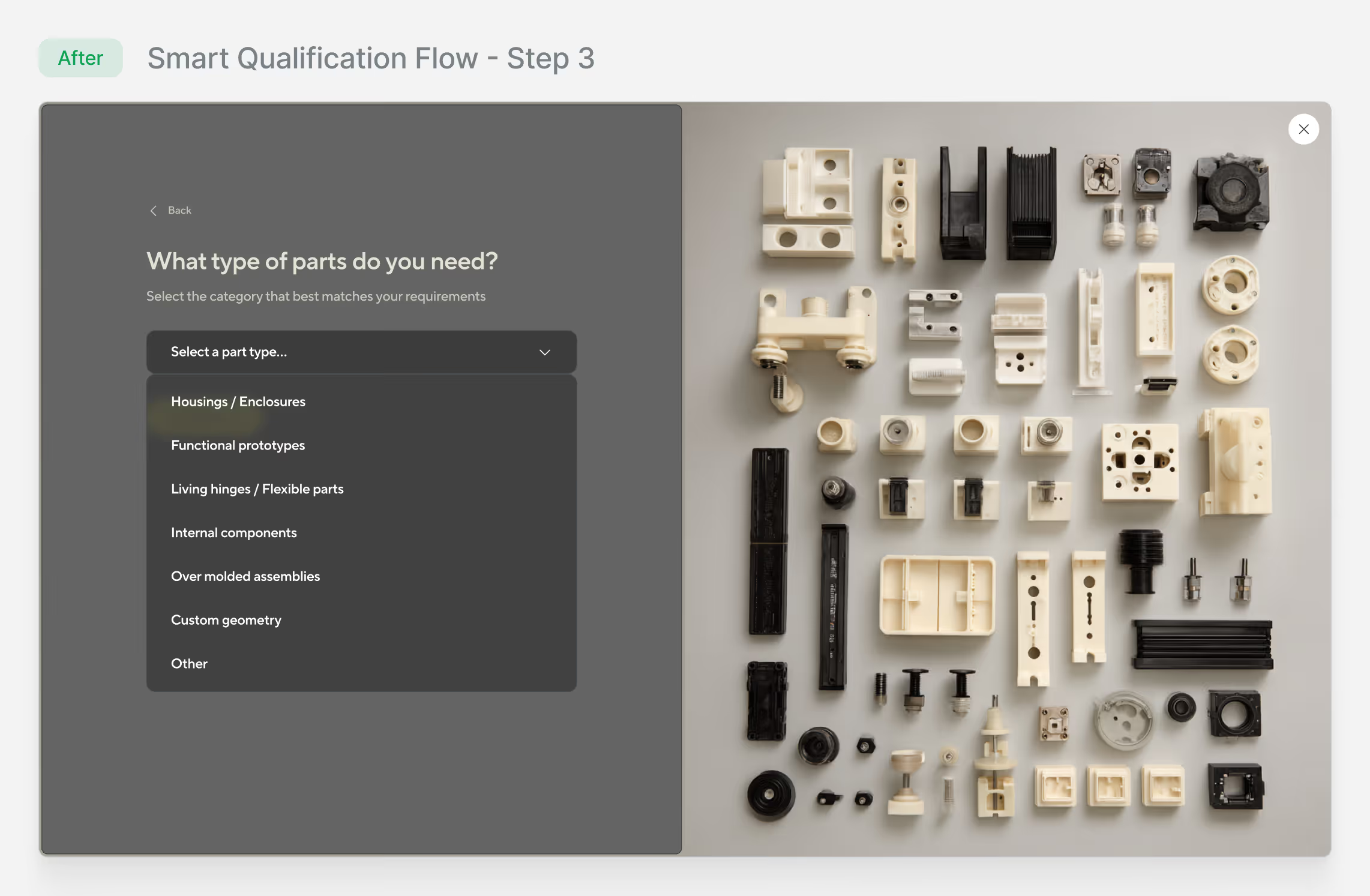
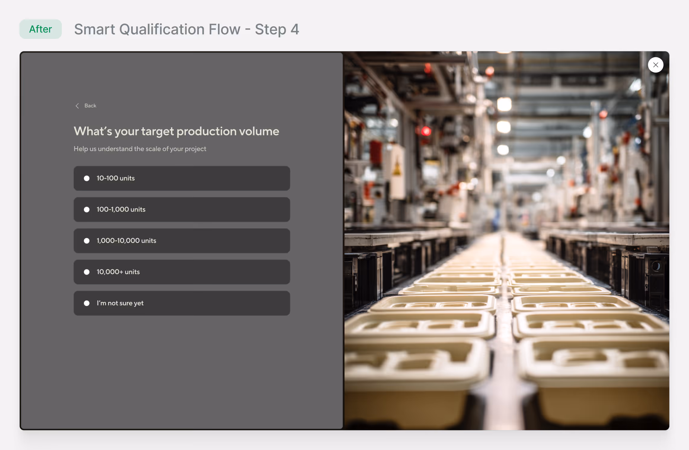
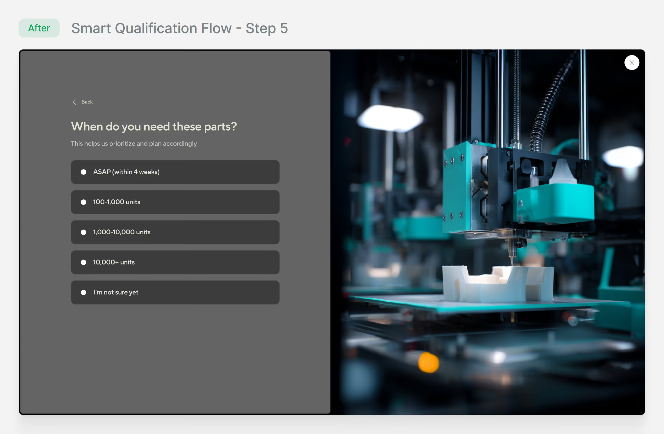
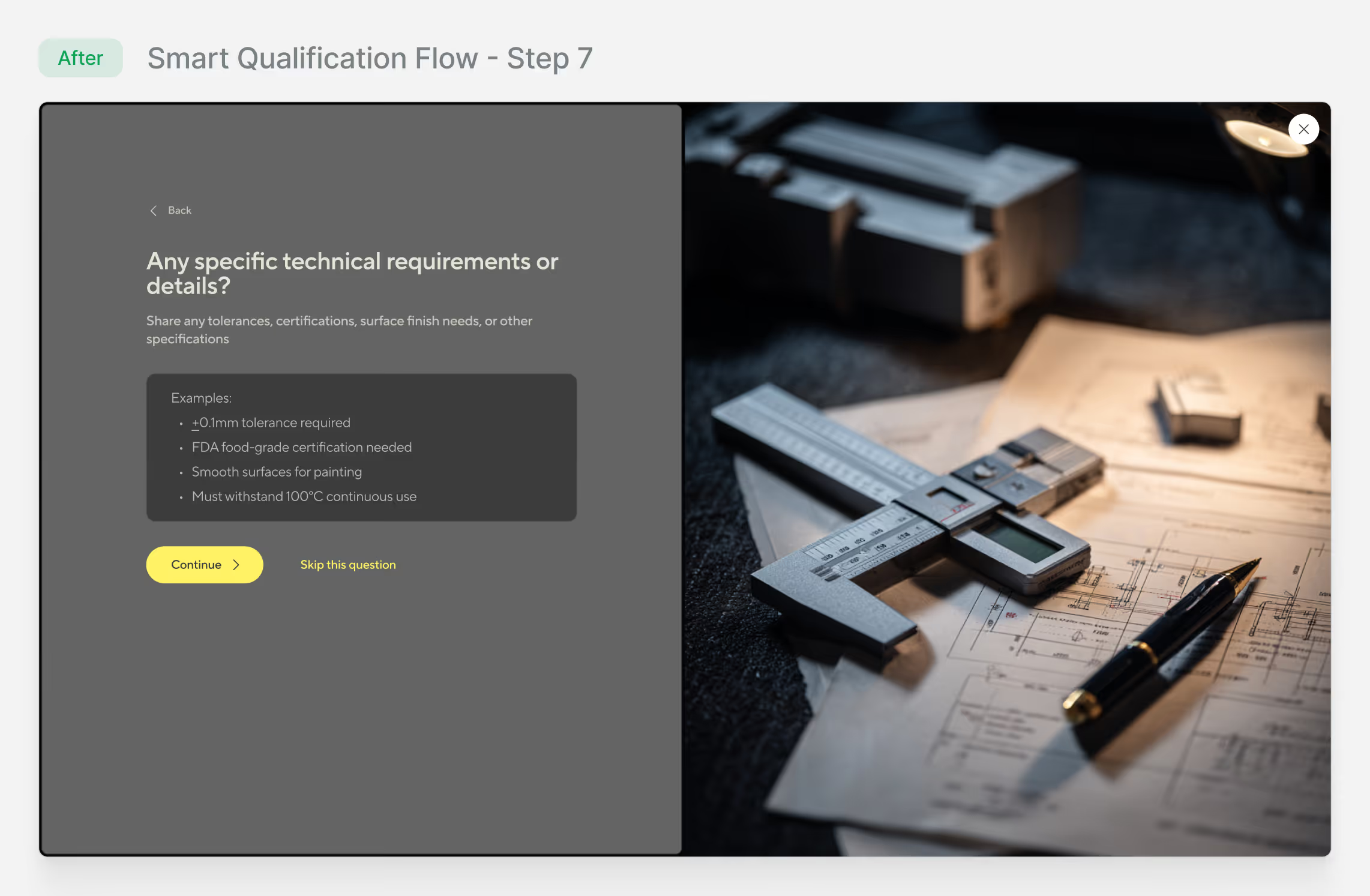
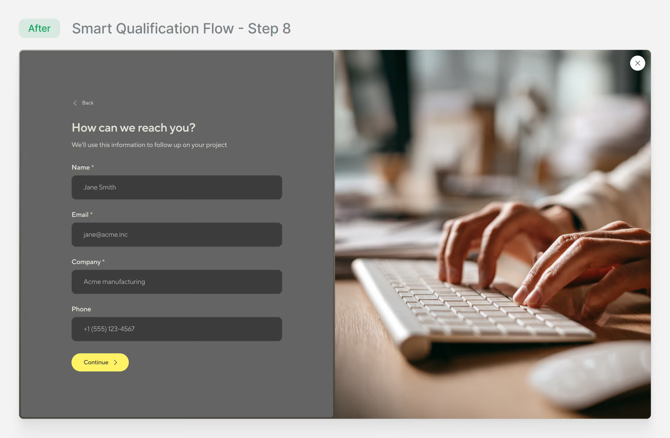
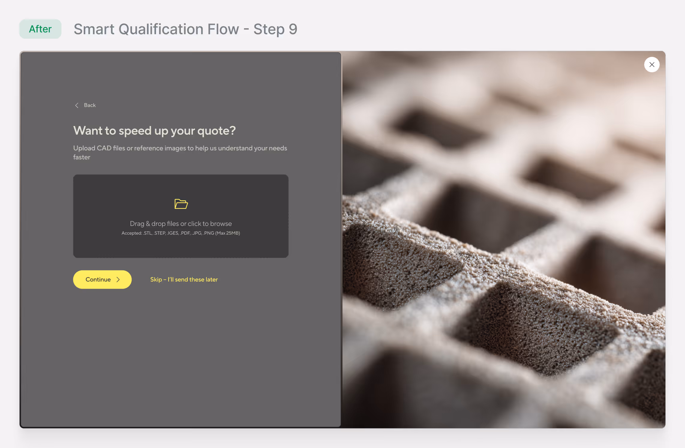
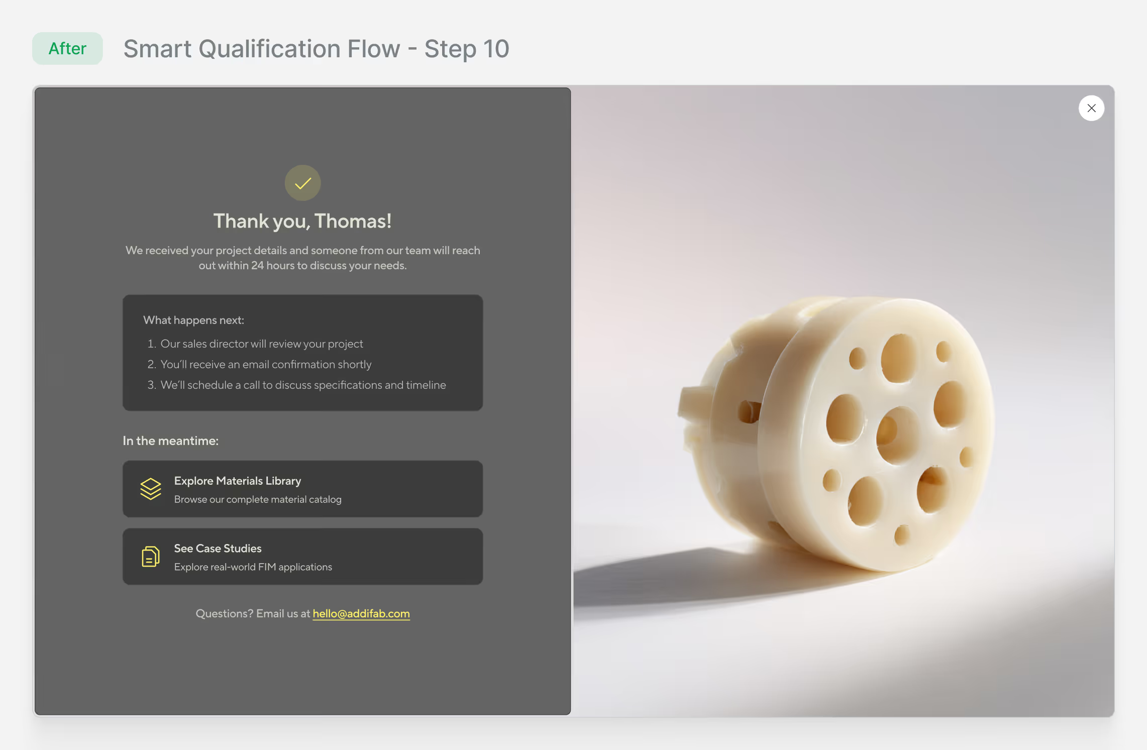
Smart Qualification Flow
Designed a progressive form that captures project details before sales contact, increasing qualified leads from 15% to 67%.
Research & Insights
To get a deeper understanding of the landscape, I conducted a competitive audit across 8 additive manufacturing and industrial tech companies, including traditional injection molding providers and hybrid manufacturing competitors. I also conducted 12 in-depth interviews with engineers and procurement managers from automotive, medical devices, and consumer electronics industries to understand how they evaluate new manufacturing technologies.
The research revealed consistent patterns: technical complexity was presented before conceptual understanding, navigation structures assumed prior knowledge, and visual systems lacked the precision needed to convey manufacturing credibility.
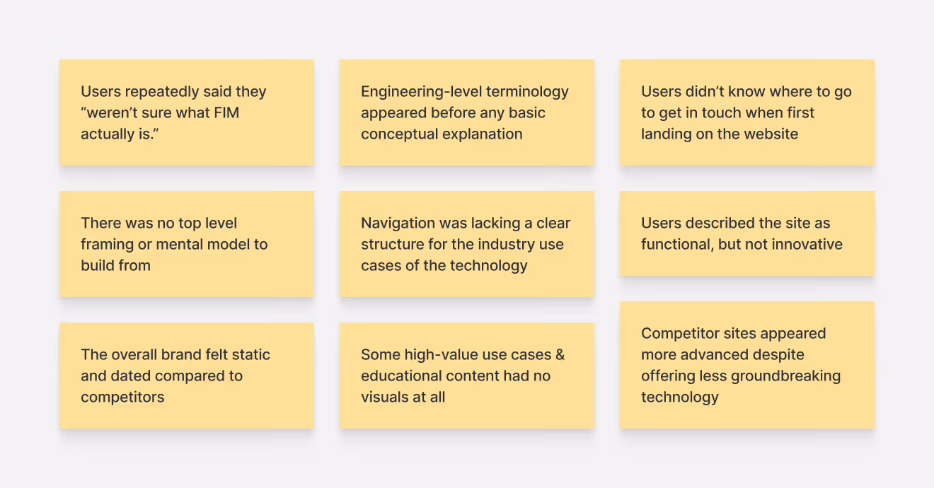
Complexity killed clarity
The old site led with technical parameters before explaining what FIM was. Users needed simple understanding first.
Navigation assumed familiarity
Technical pages were buried and content had no flow. Users couldn't find a logical evaluation path.
Visual assets were inconsistent
No consistent typography, color system, or components. This eroded trust and made scalability difficult.
The brand looked dated
The visual design felt outdated and static. This disconnect undermined credibility with technical buyers.
Information architecture
The old navigation used marketing-focused labels like "Get Inspired" that didn't match how buyers evaluate manufacturing technologies. Critical information like materials and process explanations were buried. I rebuilt the information architecture around buyer evaluation patterns.
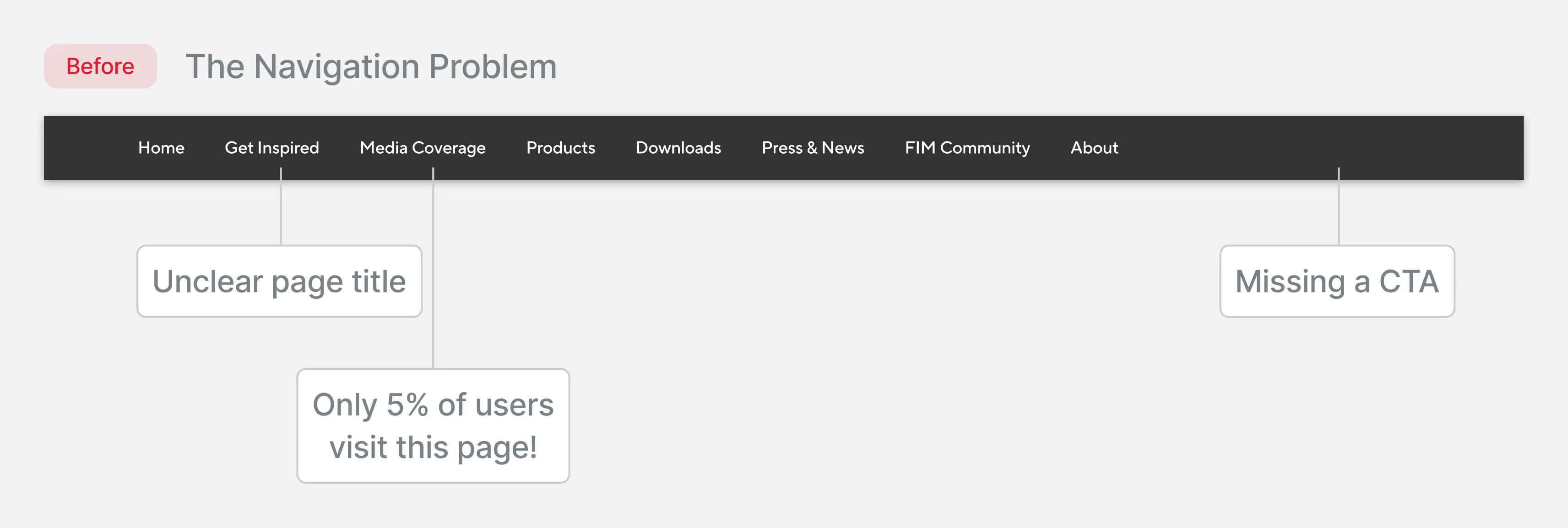
I identified several issues that created confusion for technical evaluators, marketing-focused labels like "Get inspired" provided unclear value, "Media Coverage" and "Press & News" overlapped conceptually, and content was organized by format ("Downloads") rather than user need.
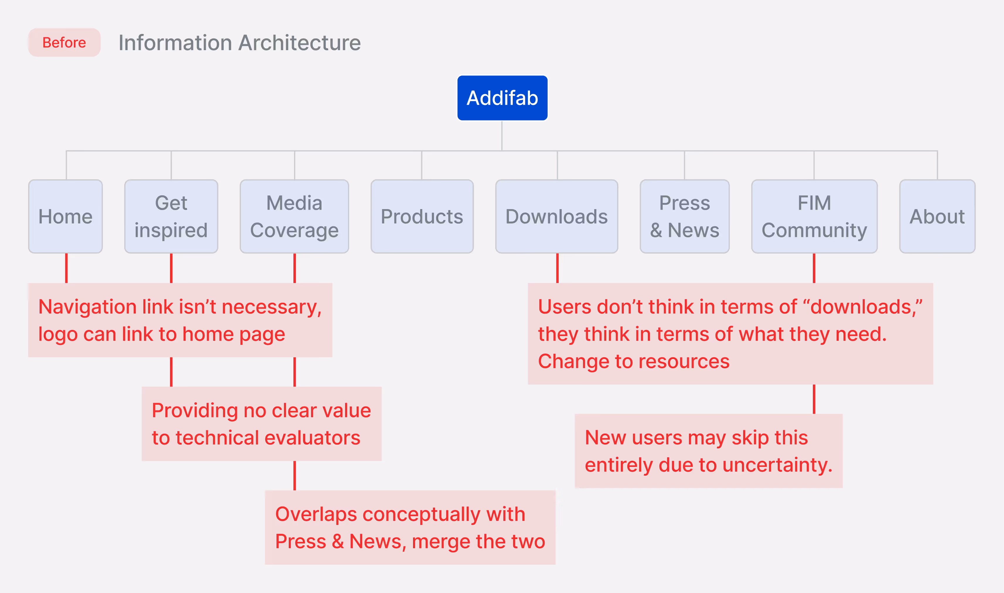
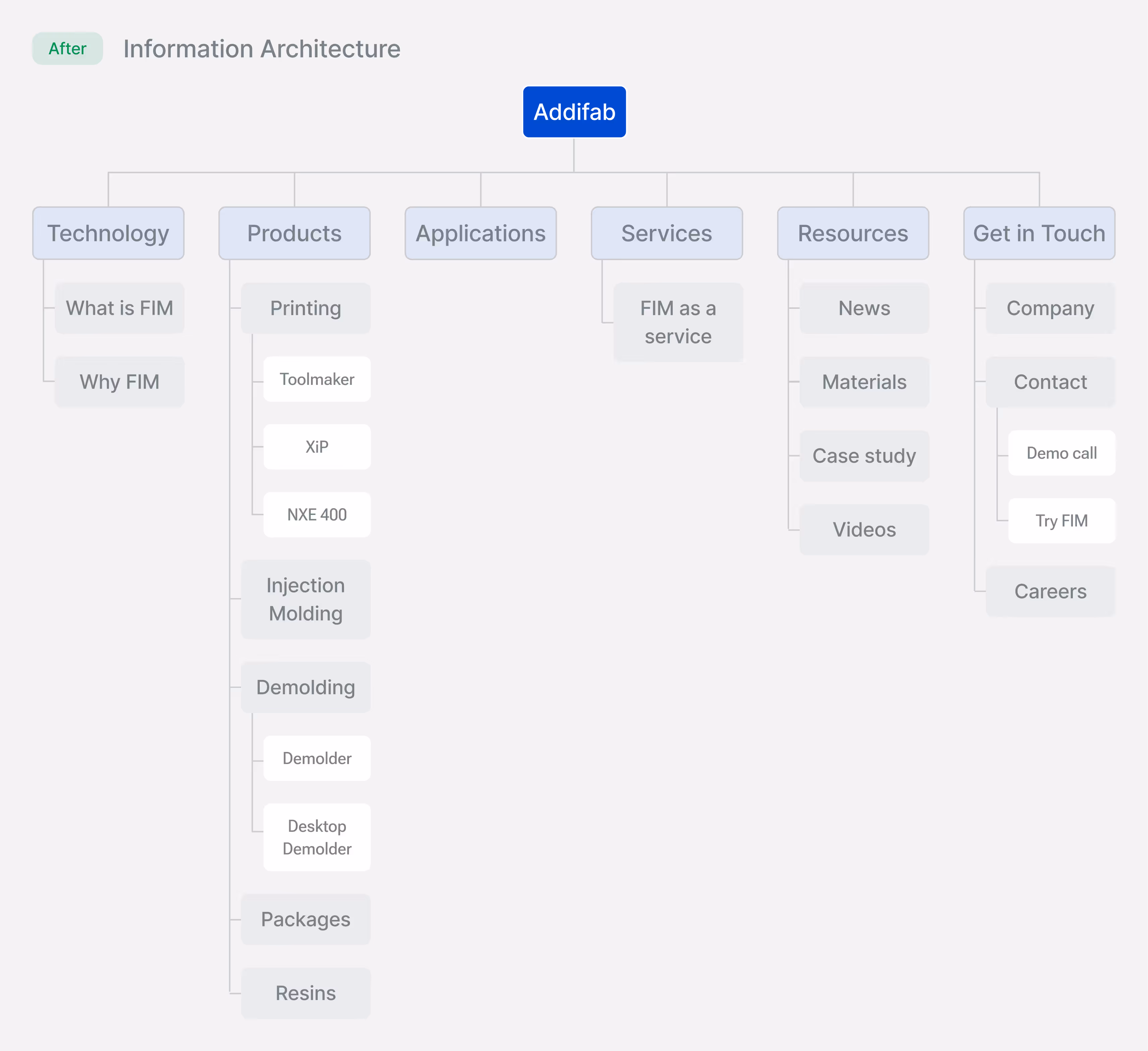
Reorganized around clear, functional labels that match evaluation flow: understand technology → explore products → see applications → understand services → access resources → engage.
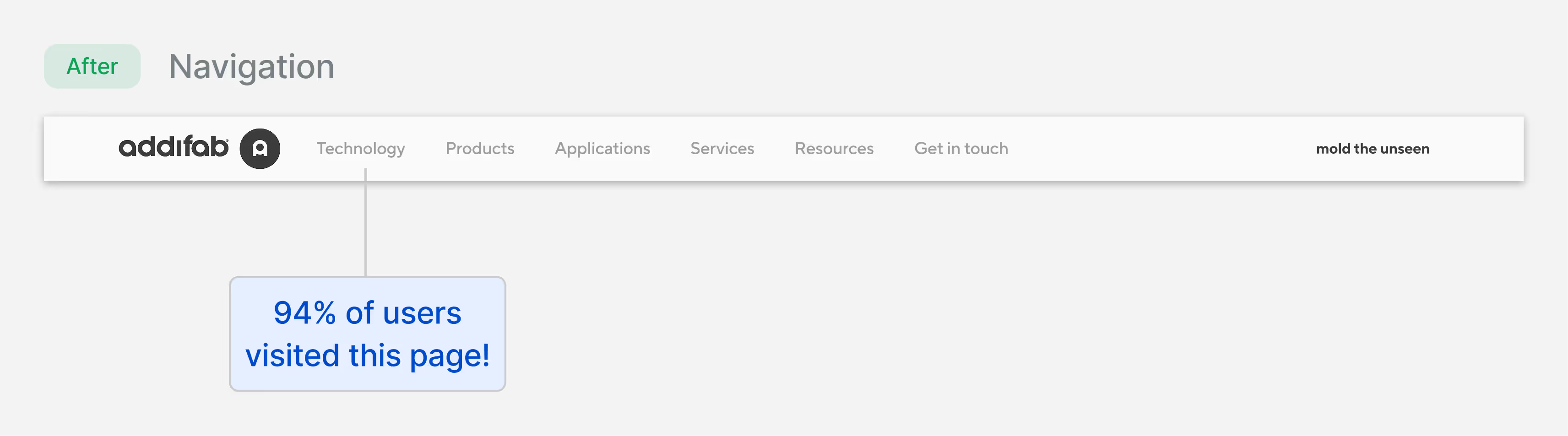
40% decrease
In navigation misclicks
23% increase
in users reaching contact
2.1 → 4.8
pages per session
The streamlined structure enabled self-service behavior, directly contributing to the 62% reduction in technical support emails.
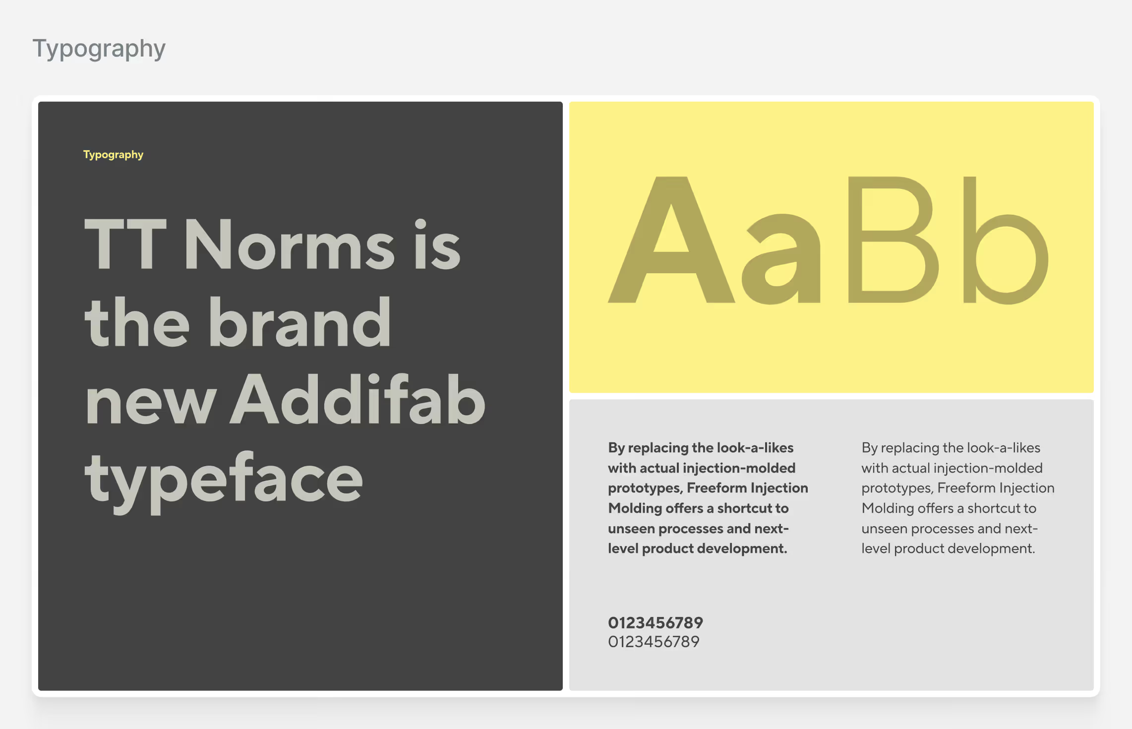
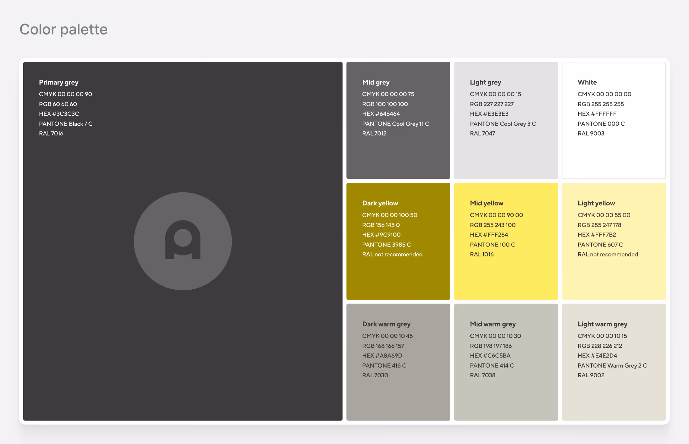
Brand Identity
Precision as a Credibility Signal
Addifab had a logo but no brand system. No colors, no typography standards, no visual guidelines. Every marketing material, social post, manual, and web page was built from scratch. I created a complete brand identity that scaled across all touchpoints while reflecting manufacturing precision.

Final designs
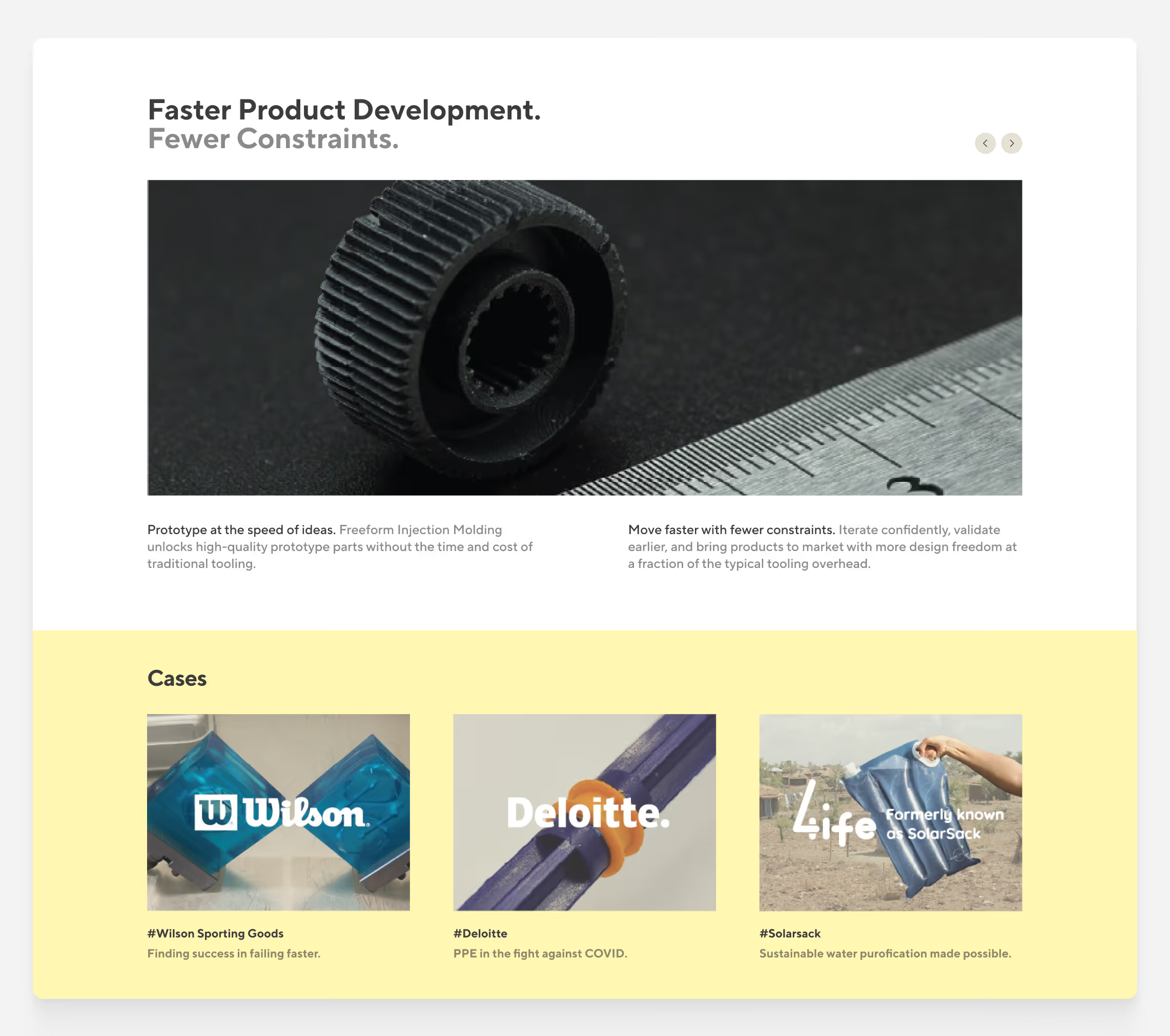
Building a Systems That Scales
The final deliverables include website pages, brand identity applications, custom iconography, social media templates, and marketing collateral. Each piece reinforces the geometric precision of the brand while giving Addifab's team the flexibility to create new materials autonomously.
Outcomes
The redesign launched in May 2022. Within six months, the website shifted from passive brochure to active sales tool — educating prospects, qualifying leads, and reducing operational burden on the sales team.
298% increase
Time spent on materials page
143% increase
In demo request conversion rate
62% decrease
in technical support emails
The numbers validated the strategy, but the real shift was qualitative: sales calls became consultative instead of educational, prospects arrived informed, and the team could scale without adding headcount.
Reflections
In deep-tech B2B, your biggest competitor isn't other companies—it's confusion. Addifab had superior technology but lost deals because buyers couldn't understand it. The challenge wasn't aesthetics. It was building a system that transforms complexity into clarity without sacrificing credibility.
What worked well
Leading with buyer questions instead of company answers. Treating brand as a credibility signal— geometric precision reflects operational precision. Building for team autonomy, not just delivering files.
What I'd do differently
Get quantitative baseline earlier — I relied heavily on qualitative research. Allocate more budget to video content (the one video has 89% completion rate). Build comparison tools from the start instead of adding them later (now the most-used feature).